Gentrification can occasionally foster good design rather than vulgar excess. As the humble cottages on narrow lots in Venice rise past the $1 million mark, the challenge for architects is to satisfy the expectations of new buyers without destroying the character of the community. Inevitably, some developers have maxed out their sites with dumb boxes, but it’s exciting to see how other people have curbed their greed and developed inventive solutions.
Last year, three young architects collaborated on a trio of two-story additions for a young Persian couple, giving 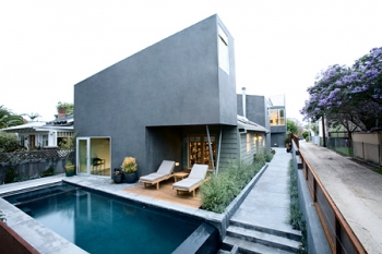 them an extra 2,500 square feet to enhance their 900-square-foot bungalow without overwhelming its more modestly scaled neighbors. The couple works at home-he’s an entrepreneur, she’s an artist-so they wanted private work spaces, a separate area in which to live and entertain, and a rental unit for income to offset the cost of the expansion. They contacted Ali Jeevanjee, who was then working at Gehry Partners, and he brought in SCI-Arc graduates Steffen Leisner and Philip Trigas. Together they adopted a subtractive design strategy, carving away at a block that represented the total addition and redistributing it to the front, middle, and rear of the long, skinny site. To conform to code, they cut away one side to accommodate a walkway, and they angled each two-story block to maximize sunlight in the front patio and the central courtyard. The angled gray stucco facades and the opposed pitch of the three corrugated metal shed roofs introduce a lively rhythm in the progression of volumes strung out along a linear axis.
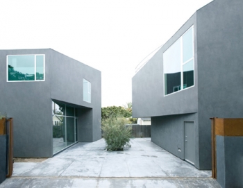 The sequence of spaces begins with the front addition, cut away to create a porch, and containing a library, study, and second-floor meditation room that includes tapering walls, an inclined ceiling, and a high window to frame the sky. This addition attaches itself to the front of the original bungalow, with its gable roof and tie rods, which is now a dining room and kitchen. Through this space one walks through a bracing arch that frames the newly attached concrete-floored living room and upstairs master bedroom. The snug bedroom borrows space from the stairwell and from the bathing and dressing area on the opposite side. At the rear of the site, beyond a wedge-plan courtyard, is the third pavilion. It contains a rental apartment at ground level and the wife’s studio above, from which a top-lit stair leads to the roof terrace, where a shutter rolls up to reveal an expansive opening framing a panoramic view over the neighborhood. The design went through several iterations, allowing the clients to critique the models at each stage. Leisner describes the pavilions as “follies,” but each is carefully calibrated to play off the others. Not a foot was wasted and every feature does double duty or offers more than one perspective. Large and small openings are carefully positioned, and they complement expanses of blank wall. Landscaping adds another layer of richness. Water splashing from a pool in the front patio, a wide-branched olive tree, and a profusion of flowering plants are reminiscent of the land the wife left as a child, 20 years ago.
Michael Webb
Source: www.american-architects.com